Because Portland needed to know
For over 35 years, Oregon Metro has helped shape the political, social, economic, and physical landscape of the tri-county area. During that time, they’ve been using the exact same logo. It was a cool logo, based on an original handmade woodcut designed in the late 70’s. But its time had come.
Early discovery led us to a key finding: although most people knew about Metro, almost nobody recognized their logo on sight. Looking at the crowded public service and government landscape in which Metro was vying for attention, it wasn’t hard to see why. To add to the confusion, there are several hundred visual identities associated with “Metro” around the world. That’s all to say, we knew a lot about what we didn’t want to do with the logo.
Logo Design
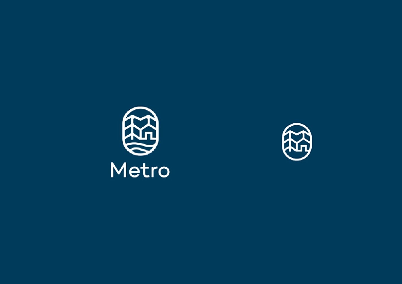
Figuring out what we did want to do with the logo took the form of a competitive analysis, which explored other brands facing similar challenges and possible conceptual solutions. Design exploration resulted in a wealth of logo concepts. Together with Metro, we winnowed down options, while simultaneously concepting a brand hierarchy by mapping Metro’s many touch points and defining communication requirements for each. After five months of solid work, we had several strong logo and identity systems. We ran them all through user testing and refinements. The final result is simple and clean, but with a lot of depth in meaning.

Brand Elements
On the back of the logo, we explored typography and color—both of which needed to meet a host of usability requirements. Then we designed an illustration library and a whole bunch of collateral material. Over a year after the project started, we began seeing the new Metro logo on buses, signs and recycling bins all over town. With any luck, it’ll still be around in another 35 years.